galley
"A dark & moody Roncesvalles transformation.”
It’s not easy pitching a black living room (ceiling included) in combination with a purple kitchen. But for this Roncesvalles century home, we knew the design had to be a little bit more dramatic than what we saw from the real estate listing.
Our first step was replacing the floors to be more contemporary with a wider plank and a touch of warmth on the yellow side.
LOCATION
Roncesvalles, Toronto
Size
850 sq/f.
photography
Vinh Le
YEAR
2025
TESTIMONIAL
"Every time we hesitated about a bold choice, they encouraged us to go for it. The result is a gorgeous home that we truly love living in."
Dessy D.
galley's design process
Watch Luca take you through our design process and how we arrived at such a bold scheme.


Once we decided on the floor colour, the scheme for the rest of the home fell into place. The kitchen had good bones and a layout that worked well so we suggested refacing the kitchen and installing a new countertop and backsplash rather than ripping everything out.


Our immediate suggestion was to go with a two-tone kitchen with the base cabinets and island being a deep purple to complement the floor and the uppers an off white with a soft touch of warmth. We then found the perfect stone that has beautiful movement in its pattern and also has purple sprinkled throughout its design, which really pulled this look together.
Our clients are coffee connoisseurs (like us) with an elaborate set up of machines and accessories. They had a critical requirement to keep these tools out in the open for easy use but also away from the main kitchen counters.
We designed a custom coffee station with drawers to match the profile of the existing base cabinets so it felt as if it was always there. Two illuminated floating shelves in warm oak provide storage and task lighting for their craft.
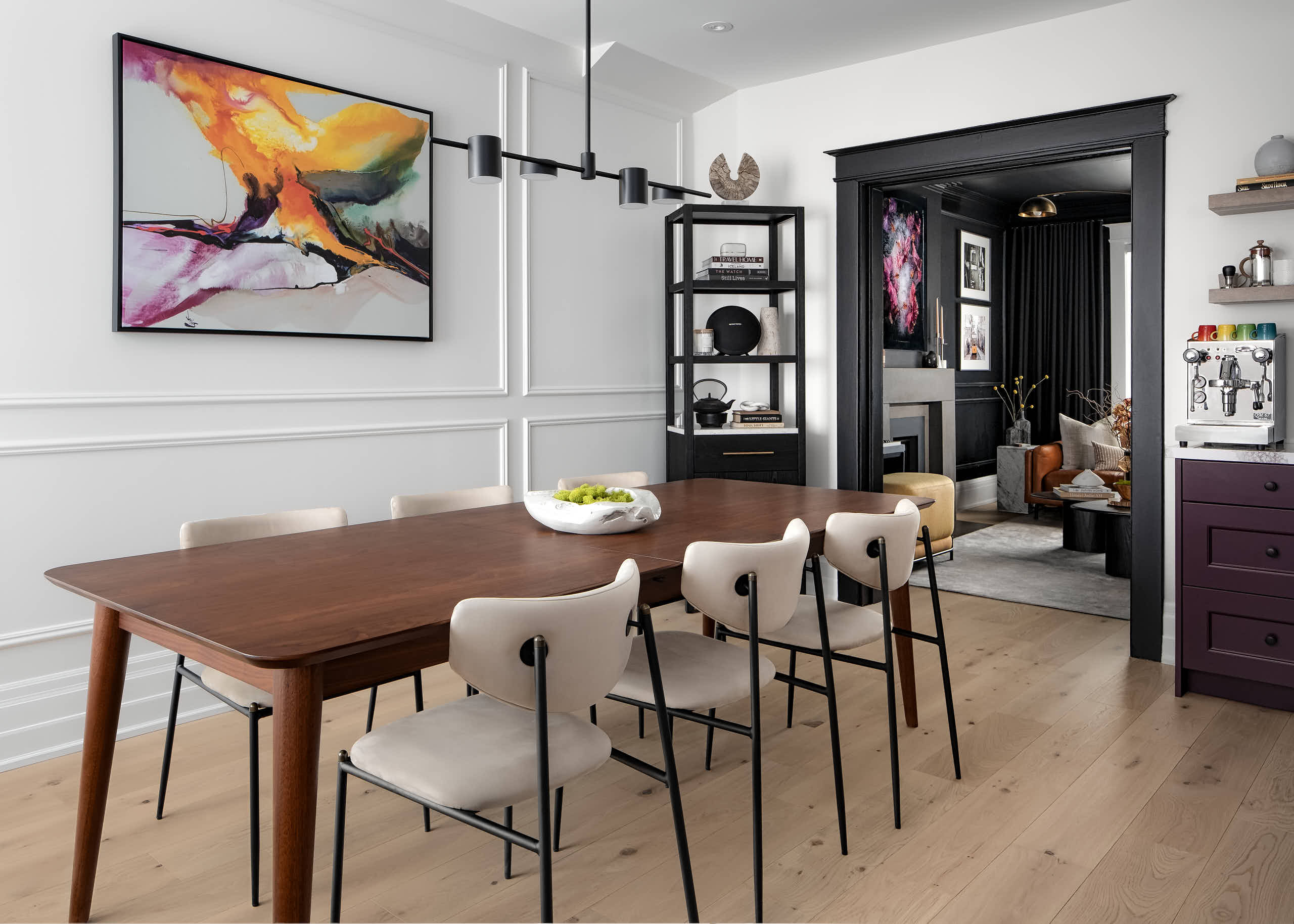
The dining area has an extendable table for 10, but is typically set for 6 for this family of 4, who often host large gatherings. The length of the dining room wall was quite long, but it was also a heavy traffic route, so we proposed not to put furniture against this wall and instead do wall panelling, which we continued into the living room.
The living room is nothing short of bold, and after assuring our clients the room would not feel too dark, we went ahead with black everywhere. We also painted the casings around both sides of the entryways to frame out the living room when looking on from the foyer and dining area. It feels like a portal luring you into this room.


Tone-on-tone black is used in a lot of the accent furniture, including the picture frames, coffee tables, piano, shelves and drapery, whose texture warms up this room considerably. A neutral grey armchair is tucked in one corner so that your eye goes right to the yellow piano bench and the caramel leather sofa.
This home is proof that dark and moody doesn’t have to mean gloomy. With thoughtful design, smart layering, and a fearless approach to colour, it’s become something really special and unique from all their neighbours.

our client's testimonial
From the very beginning, Luca and Vinh were an absolute dream to work with. We did design plus implementation with them, and they took care of everything—every little detail, every delivery, every moving part. We never had to worry about the behind-the-scenes chaos that inevitably comes with a project like this.
They brought so much creativity and confidence to the table. We trusted them completely, and every time we hesitated about a bold choice, they encouraged us to go for it—and every single time, they were right.
Their eye for detail is extraordinary—even as detail-oriented people ourselves, they caught things we never would have noticed. The process was smooth, enjoyable, and really fun, and the outcome is something we’ll cherish for years to come.
We could not recommend Luca and Vinh more highly. They are the very, very best.
going dark
During our initial consultation, we picked up on our clients being drawn to darker rooms and a moody vibe. We suggested starting with a mock up of an all black living room and see where it goes because we could always scale back. The rest is history.


the main floor
This century home was built during a time when television was not even a thought, and when our clients agreed that the viewing area was more suited for the basement, it allowed much more opportunities for a functional layout that wasn’t T.V oriented.
Deciding whether to gut the kitchen or work with its existing footprint was a significant investment call. We ultimately determined the original layout could meet this family’s needs, provided we overhauled the aesthetic.